Poster Number One
Image
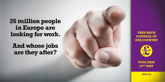
In poster #2 for the 'UKIP' political party use a very stern and straightforward approach to their message. It features an image of a hand, a male caucasian hand might I add, firmly pointing with his index finger to the reader. The image is quite simple, and attention-grabbing, which of course is the aim. And shadow is casted on the rest of the picture by the hand, filling in the empty space and giving it a serious tone.
Font
For the font, a serif font is used all throughout the poster. UKIP, controversially, want to restore England to how it once was, with jobs going to British people, and not so much to immigrants, as we so is so increasingly the case today.
Serif font being a 'traditional' font is why I think they opted to use it throughout their poster.
Colours
The colours on the actual main part of the poster and quite mono-toned for that serious look and feel, but to the right side column we see a rich and deep purple being used. For one, its the party's colour. Also it really captured the attention of the reader effectively.
Purpose
To get People to vote UKIP and take back their jobs from foreign workers.
Poster Number Two

Image/Colour
For poster #2 a black and white picture of who I assume are the leaders of the Labour Party at the time this poster was commissioned, is used. Making them look serious, yet fun as they are smiling in the picture. Though this is a complicated combination to have, they do pull it off and it works well. I really love the background used. It is a very vibrant solid shades of yellow. This works well as it creates the perfect contrast between itself and the black and white image, whilst maintaining its relaxed, 'down-to-earth' mood. Also the subliminal messages that the colour yellow induces is the urge to buy something. So Labour might be using that to get the public to ‘buy’ into them with their votes.
Font
The font used is a big and bold sans-serif font. It’s quite modern and gives the poster a clean look and feel to it. With the bottom text smack down in the middle of a thick black bar. Really making it stand out.
Purpose
To get the viewer to vote for labour by showing them that they can give them a better government, and hence a better life.
Aims
Raise help the public to see that if they vote for Labour, their living conditions will greatly improve.
Poster Number Three

Image
In poster #3 for the Conservatives a photograph has been used showing a long line of person queuing up to an unemployment office. This photograph works fantastically well. It really drives home the point of how bad the unemployment rates are with the Labour Party in power.
Font
For the font, a sans serif font is used all throughout the poster. Giving it a very bold and modern look. Making it not only easier to read, but as a result it’s also quicker to read. The rich red and deep black colours used also makes it very eye-grabbing and easy to read.
Colours
The colours used are plain, black and whites except for the crowd’s clothing. Good colours for the serious mood of the poster.
Purpose
Inform the public that with Labour in control, the unemployment will be high, so they should all vote conservative.
No comments:
Post a Comment