For this post I will be analysing the October 2012 edition of Empire Magazine

Font
For the magazine cover for Empire, we see the sole use of sans-serif fonts. This is to give the magazine a modern and clean look and feel. All the text has been made bold, and simply the different font sizes have been used throughout. Also the same font is used throughout the cover, to maintain its unity, and make it easier to read.
Images
The image used is one of actor Daniel Craig as James Bond. The image employs a direct mode of address with Daniel looking straight down the barrel of the camera (See what I did there?). He has a very domineering and powerful stance, bring out the very character of ‘James Bond’.
Colour
The background colour is dark blue. A very ‘James Bond’ colour as it is stereotypically rich and prominent (and also it really brings out his eyes). The main text is either white or a deep red. This is because those colours really stand out on the image and background, bringing out the bold approach they are trying to convey.
Layout
The layout is just a little bit too crowded. The big bold text eats up so much of Daniel Craig that all thats really left is his head, which it itself stretches right over the Empire logo.
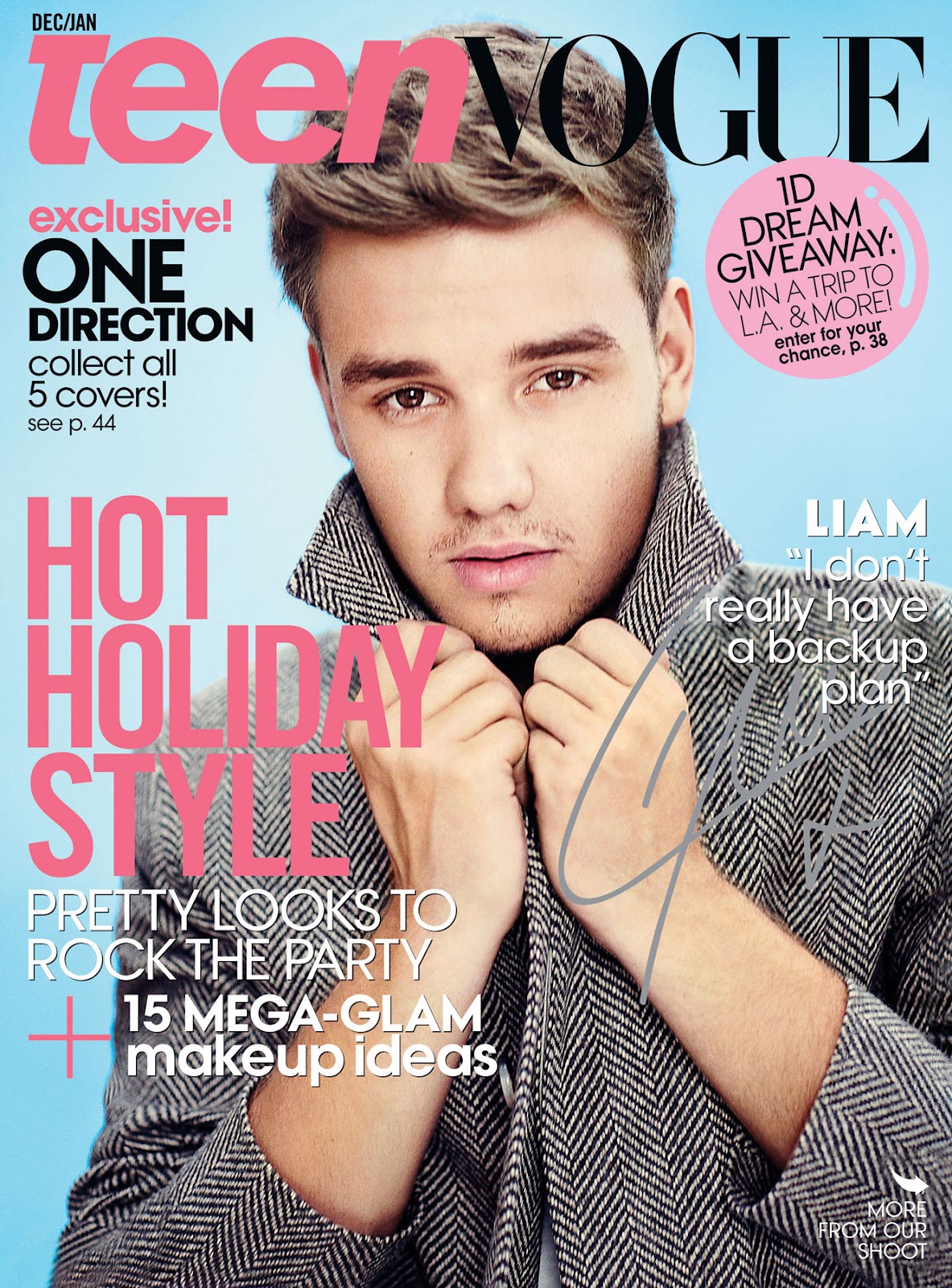
For the magazine cover for Teen Vogue (which is the most popular teen magazine in the world with a total circulation of 1,045,813) we see the use of sans-serif fonts everywhere, except in ‘Vogue’ in the logo. That is the only place where a serif font is used. I believe this is because Vogue is a massive brand name, and in the parent magazine, ‘Vogue’ spelt out with serif, so in this teen version it still carries the brand design, even though ‘Teen’ is spelt out in sans-serif. The sans-serif font is to give the magazine a modern and clean look and feel. The serif in ‘Vogue is used to connect it the the parent magazine.
Images
The image used is one of teen ‘heartthrob’ Liam Payne, of the massively popular One Direction. The image employs a direct mode of address with Liam looking straight into the camera, or, at the viewer. His overly cheesy pose, and heavily styled hair and makeup is definitely used to appeal more to girls, as it is not at all stereotypically masculine.
Colour
The background colour is pale blue and the main text is pale pink. This is because those colours are stereotypically quite feminine, as this target demographic for this magazine is for young females.
Layout
The layout is just a little bit too crowded. But not too much so as to the point of it becoming confusing to read. It hits that little ‘sweet spot’.
Font
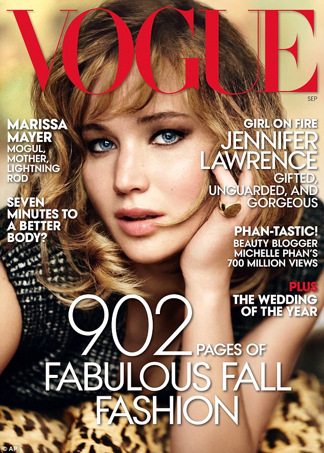
For this magazine cover for Vogue we see the use of sans-serif fonts everywhere, except in ‘Vogue’ in the logo. That is the only place where a serif font is used. I believe this is because Vogue is a very prestigious brand name and the serif font gives it a high-class touch, whereas the sans-serif font gives the magazine a modern and clean look and feel.
Images
The image used is one of the ever ravishing Jennifer Lawrence. The image employs a direct mode of address with Jennifer looking straight to the viewer. This seems to be a reoccurring pattern. Magazines must be more appealing if the person on the cover is ‘engaging’ the viewer as it were, just by looking at them.
Colour
The background colour is from the picture and is very out of focus. The colours used throughout are on the orange/yellow side, which really brings out her eyes as the colours are opposite on the colour spectrum. The main text is either white or a deep red. This is because those colours really stand out on the image and background, bringing out the bold and seductive approach they are trying to convey.
Layout
The layout is just a little bit too crowded. But not too much so as to the point of it becoming confusing to read. It hits that little ‘sweet spot’.
No comments:
Post a Comment